
Häagen-Dazs
2020 Campaign
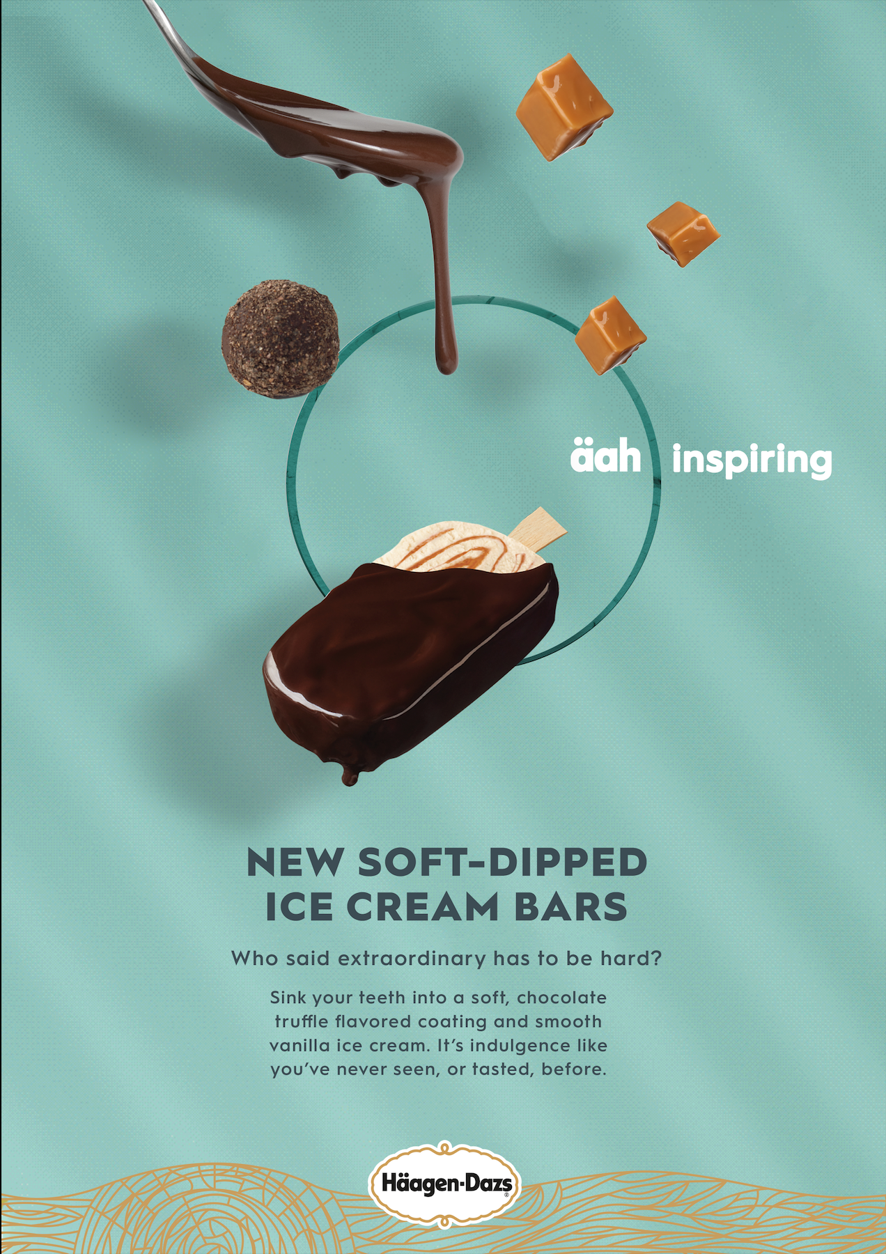
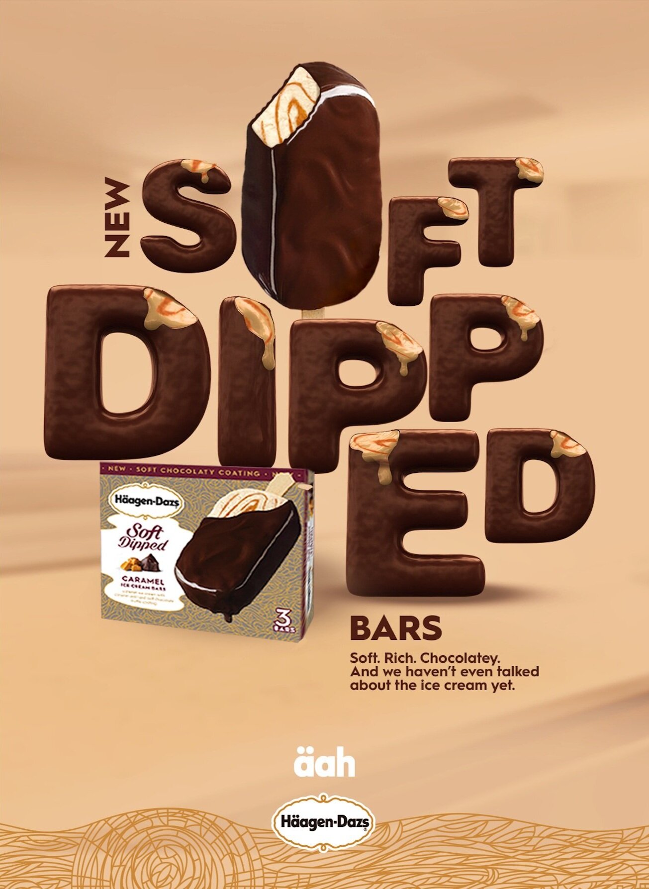
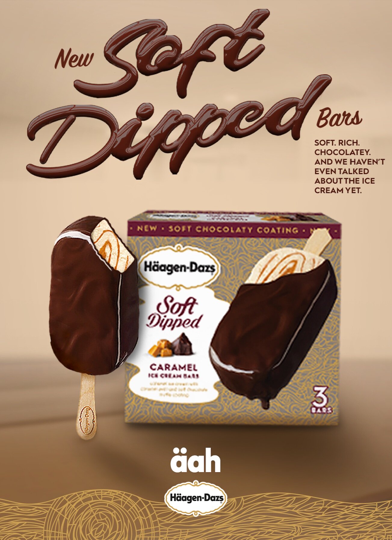
Häagen-Dazs was excited to introduce its new soft-dipped ice cream bar–a revolutionary idea in ice cream. No hard shell–soft on the outside, soft on the inside.
They additionally introduced their ruby cacao collection, which features a decadent crunch of a ruby cacao shell and creamy sweet cream ice cream for a sensorial experience of luscious smoothness with berry fruity notes.
Context: 11 Weeks, Grey New York
Contribution: Han Lin–Executive Design Director; Juliano Domingues–Associate Creative Director; Ho Seok Lee–Designer; Michelle Liuzzo–Senior Art Director; Sarah Attalla–Junior Designer


Process & Iterations: Brand Assets
Logo
The wordmark uses rounded letterforms to give a simple, timeless, and approachable feeling. The golden cartouche gives a refined and elegant impression. It creates a seal of quality and premiumness.

Typography
The brand's font is geometric and approachable with multiple weight options.

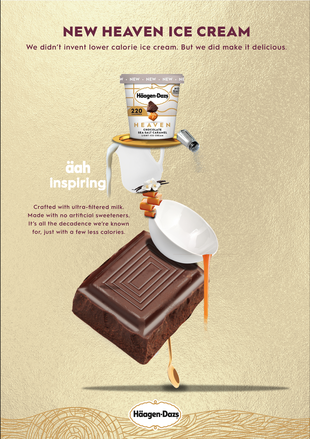
The äah:
This mark is used to show a state of indulgence.

Product
The soft-dipped campaign is based off of the new soft-dipped chocolate bars.


Tapestry:
The brand tapestry illustration is a journey from source to spoon, an invitation to discover the world of Häagen-Dazs.
Process


Art Direction 1: This uses imagery of soft objects and essences and soft, flowy chocolate to emphasize the idea of soft-dipped.
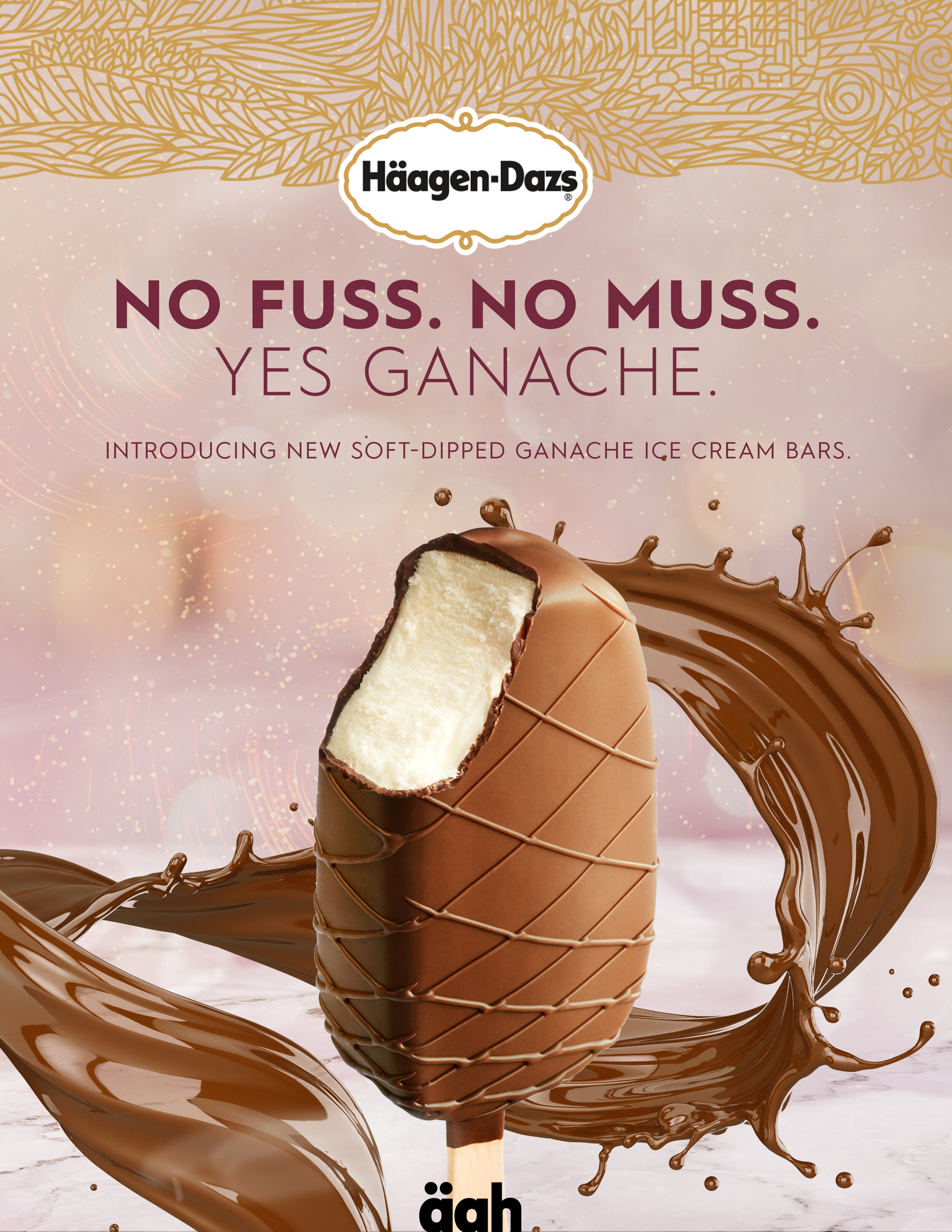

Soft objects

Ingredients


Soft, whimsical backgrounds

Direction 2: La Chapelle used ornamentation color, unique composition, and imaginative narratives to bring across beauty in his work. We used this as an inspiration to come up with a unique way to show the premium quality of Häagen-Dazs.


La Chapelle halo / ornamentation inspiration

Background ornamentation

Premium objects

Soft fudge as key ingredient
Direction 3: Inspired by minimalist sculptures, this direction focuses on creating beautiful minimalist sculptures out of the key ingredients.


Minimal sculptures

Gravity emphasizes softness
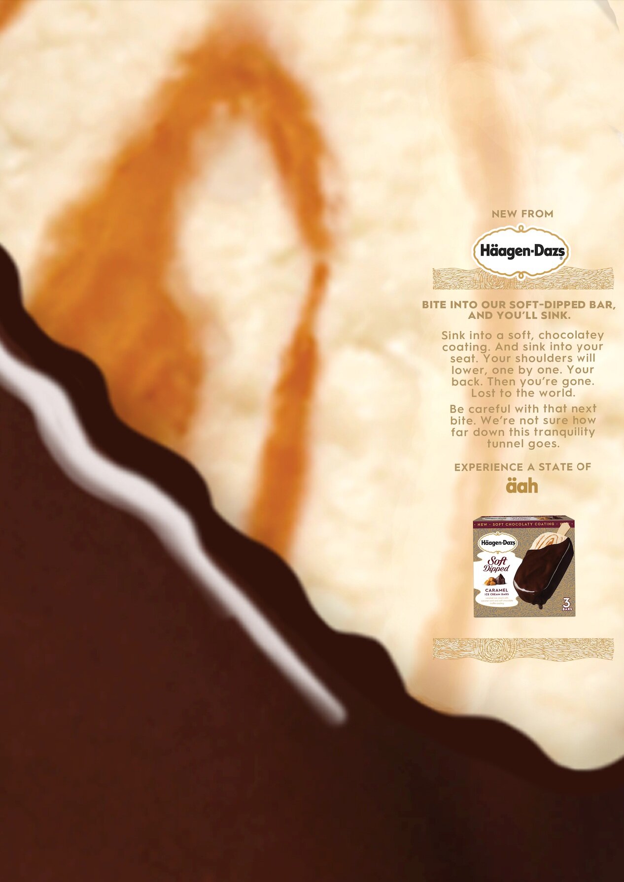
Art Direction #4: ÄAH is the feeling that rushes through your body when you experience the extraordinary. It’s a quick burst of joy that catches you off-guard. It passes through your body, escaping as a reflex smile, a subtle exhale. For a moment we sit in stunned satisfaction and everything less than äah disappears. It has no pre-determined amount of time, no set location, no clear-cut indication it’s about to happen. ÄAH is something you’ll simply know when you feel it. And when you feel it, you’ll know. This direction uses close-up imagery of soft ice cream to pull you in, with text that does the same.
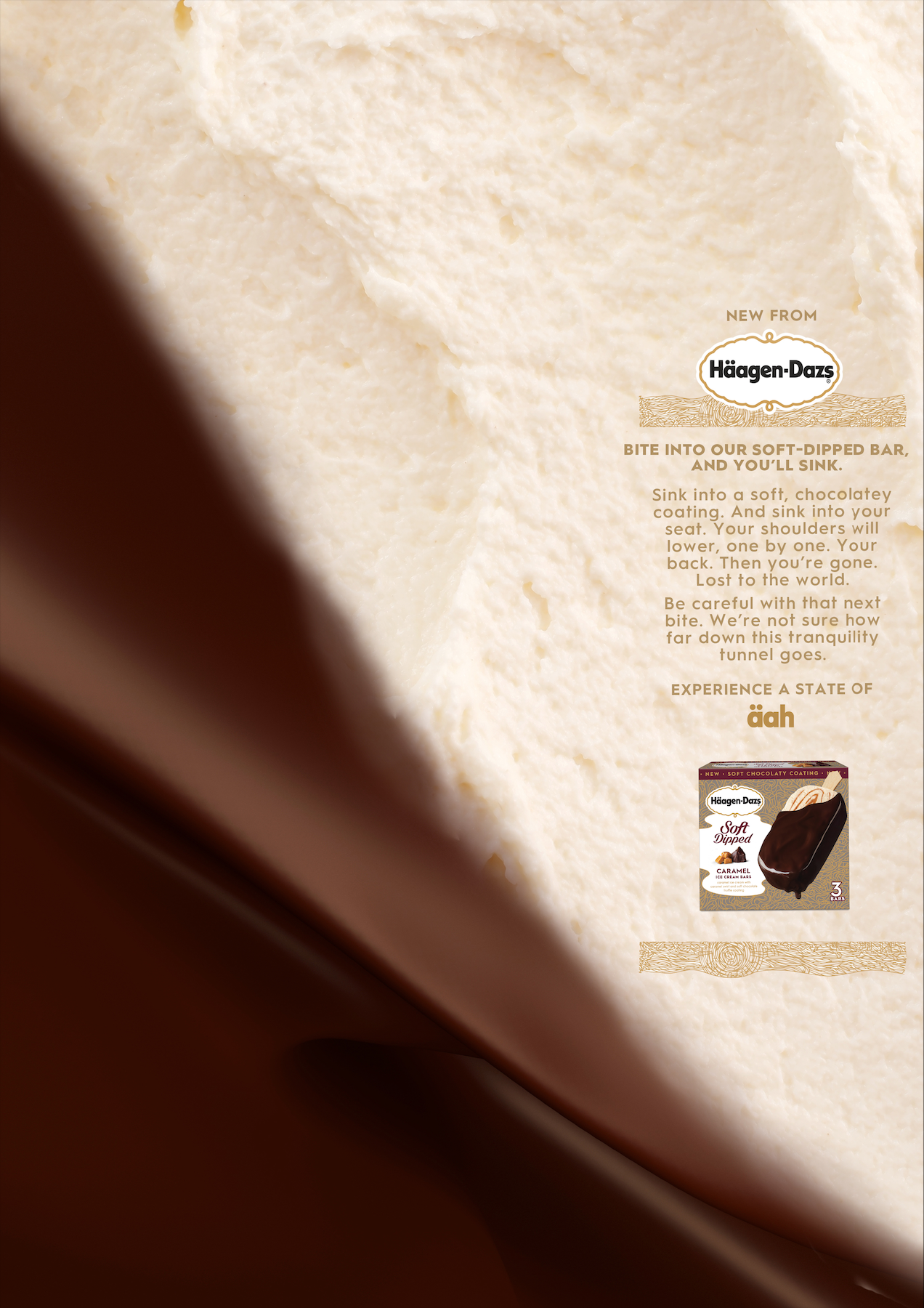
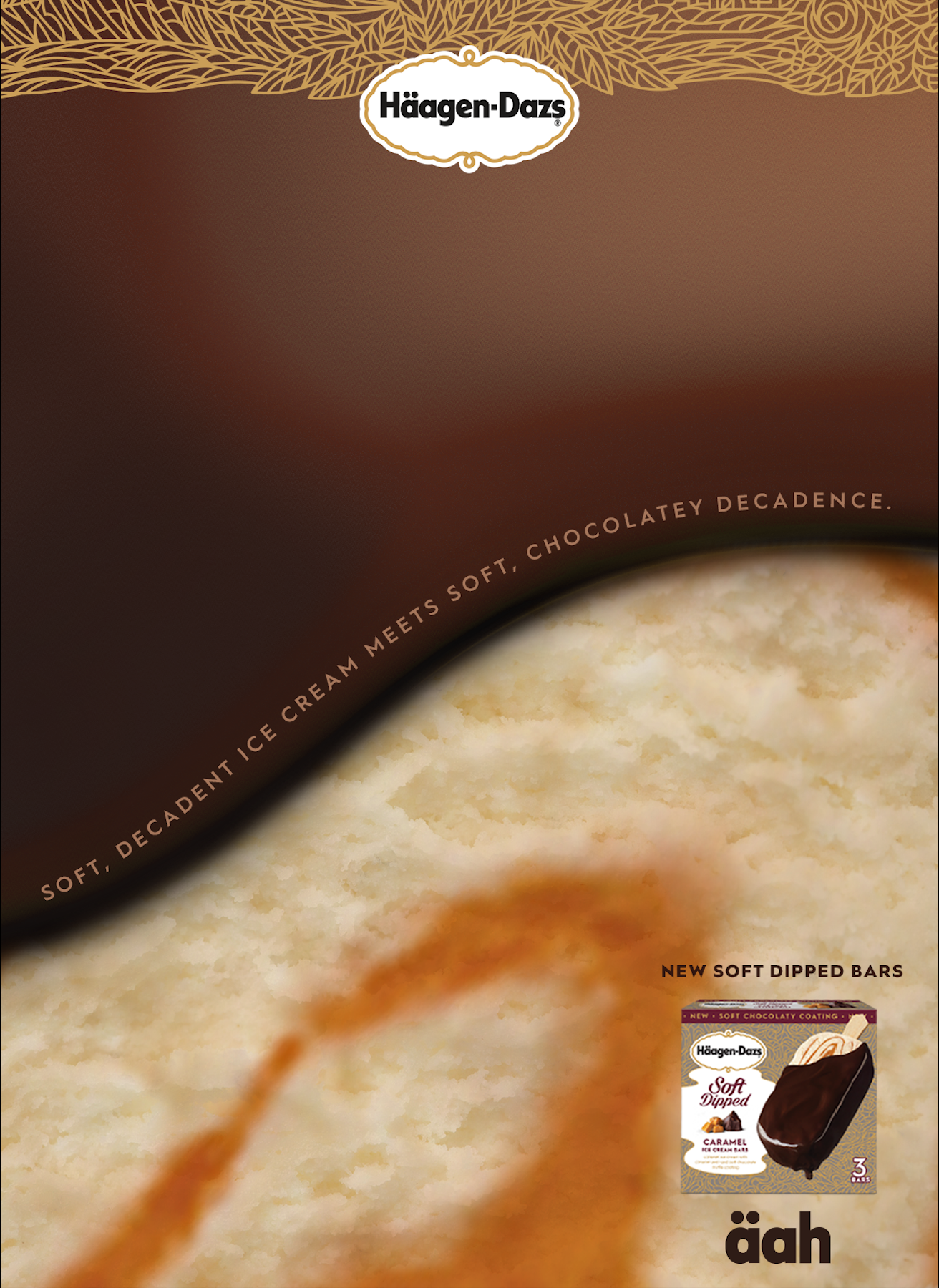
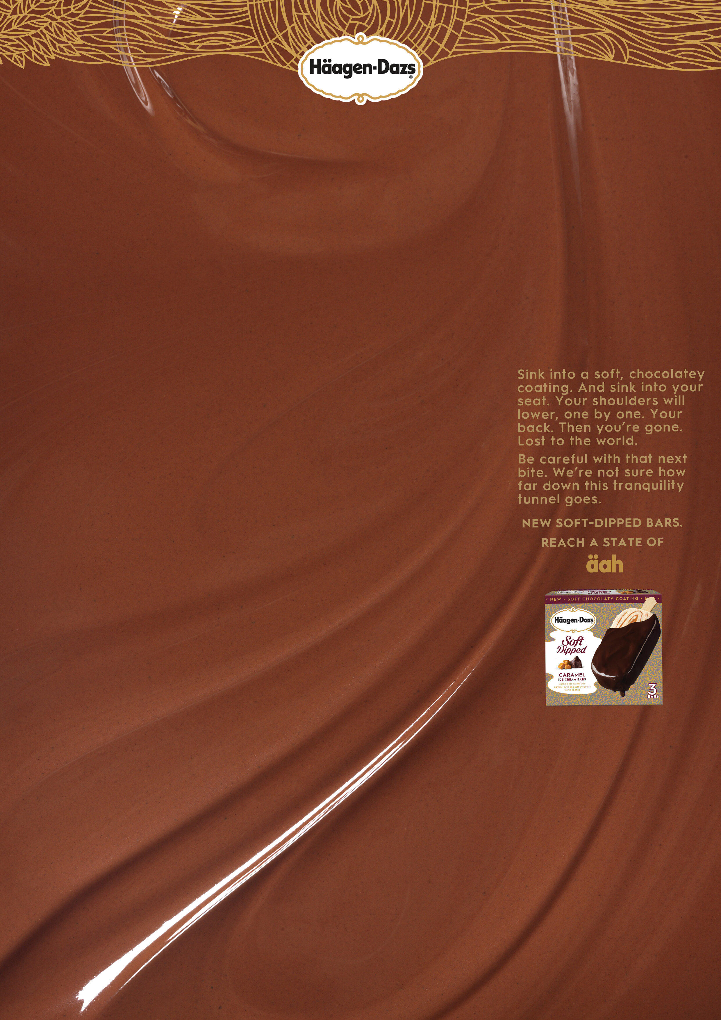
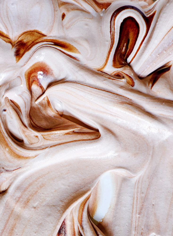
Food imagery close ups
Direction 4: With soft shadows in the background, these compositions focus on the product and use the typography to focus on the texture of the product.

3D lettering
Food decoration lettering

Final poster